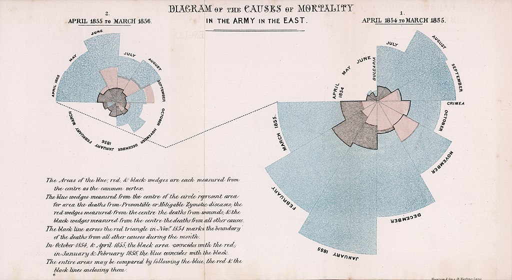
A great woman in statistics (yes, not just nursing), Florence Nightingale did great work visualising data about causes of death during the Crimean War. Her work communicating this led to changes in how hospitals were managed to ensure cleanliness and reducing preventable deaths.
I've finished the online course (Big Data: Data Visualisation) and have come to the realisation that if I ever need 3D interactive web graphic visualisations I'll be commissioning someone with the requisite skillz. However there are software with user friendly interfaces that will suffice for most needs. The course looked at design principles and offered hands-on experience with Tableau, Matlab and D3 javascript.
Someone has kindly updated Nightingale's coxcombs (rose diagrams) into interactive visualisations and provided some different designs for comparison.